
This site uses cookies
In order to gather statistical data, this page uses cookiesYou can change your preferences here
When creating a sample project for React styling approaches for the team presentation, I wanted to show all the versions in a neat and concise manner. I picked a tabbed layout, but I didn't really want to research how to use tab component from any additional library, and I wanted to spice things up a bit. So I came up with a really quick solution on how to solve tabs in pure HTML+SCSS
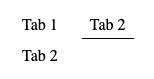
Result of this particular code snippet will look like this:
Please note, that purpose of this tutorial is to have a functioning tabs, not to visually style it
Our code will consist of 4 parts:
Container is pretty straightforward:
<div class="tabs-container"></div>Nothing fancy here. We will use flexbox to position tabs within. I'm also adding padding around container so our tabs will be distinguishable from the surrounding components.
.tabs-container {
  display: flex;
  flex-direction: row;
  flex-wrap: wrap;
  column-gap: 1rem;
  padding: 0.5rem;
}To create tab navigation I will use hidden radio buttons with labels:
<div class="tabs-container">
  <!-- TAB 1 -->
  <input type="radio" name="tab-selector" id="tab1" selected />
  <label for="tab1">Tab 1</label>

  <!-- TAB 2 -->
  <input type="radio" name="tab-selector" id="tab2" />
  <label for="tab2">Tab 2</label>
</div>
Radios need to have exactly same name, so browser will treat them as single field. Id's are not important for this component, they need to match with label (and, of course, be unique in the scope of whole page). How do style them? We hide radio buttons (labels will act as their triggers), center labels, add some spacing around them and add transparent border at the bottom. It will serve 2 purposes - to avoid item jumping, and to be able to add neat fade animation to it. Additionally we set cursor to pointer, so we can indicate that user can click this item.
.tabs-container {
  > input[type="radio"] {
    display: none;
  }

  > label {
    justify-self: center;
    align-self: center;
    padding: 0 0.5rem 0.25rem;
    border-bottom: 1px solid transparent;
    transition: border 300ms ease;
    cursor: pointer;
  }
}
Note that we're applying styles directly to descendants of .tabs-container, as we don't want this style to cascade further down.
Now we can add actual tabs to the page.
<div class="tabs">
  <article>Tab 1</article>

  <article>Tab 2</article>
</div>
Let's put this container right beneath our navigation:
<div class="tabs-container">
  <!-- TAB 1 -->
  <input type="radio" name="tab-selector" id="tab1" checked />
  <label for="tab1">Tab 1</label>

  <!-- TAB 2 -->
  <input type="radio" name="tab-selector" id="tab2" />
  <label for="tab2">Tab 2</label>

  <!-- TABS CONTENT -->
  <div class="tabs">
    <article>Tab 1</article>

    <article>Tab 2</article>
  </div>
</div>
That is full HTML for our tabs!
When it comes to CSS, we'll use flex-basis: 100% to force our tab content to be rendered in the next line. Also, let's set same padding as in navigation to have items aligned.
Then, we tell browser to hide all direct descendants of .tabs. We will later add code to show only the one that is selected.
.tab-container {
  .tabs {
    flex-basis: 100%;
    padding: 0.5rem;

    > * {
      display: none;
    }
  }
}OK. We now have the tab code done, but it does not do anything meaningful. All the content is hidden. Let's add some more CSS to make it work!
.tab-container {
  > input[type="radio"]:checked {
    + label {
      border-bottom-color: black;
    }

    // replace 2 with amount of tabs you have to generate selectors
    @for $i from 1 through 2 {
      &:nth-of-type(#{$i}) ~ .tabs > *:nth-child(#{$i}) {
        display: block;
      }
    }
  }
}
This one gets a bit more tricky than before. Let's break it down, line by line.
.tab-container > input[type="radio"]:checkedThis selector will match all checked radio buttons, that are direct descendants of .tab-container - so the selected tab "link".
.tab-container > input[type="radio"]:checked + labelWill match a label, that is a direct next sibling of previously matched, selected radio button. With that selector, we can mark the selected tab with an border bottom.
@for $i from 1 through 2 ;Then we get to the fancy SASS feature, that is a for loop. It will allow us to easily generate generic selectors for tab content. It will go from 1 to n, in this case 2, and will generate all the code that is inside, replacing #{$i} with the numbers. If you don't care about bundle size, you can generate more selectors upfront not to worry about incrementing that number while adding tabs.
// this will not work, as I skipped @for loop for readability
> input[type="radio"]:checked {
  &:nth-of-type(#{$i}) ~ .tabs > *:nth-child(#{$i}) {
    display: block;
  }
}
That in CSS will become
.tab-container
  > input[type="radio"]:checked:nth-of-type(1)
  ~ .tabs
  > *:nth-child(1) {
  display: block;
}

.tab-container
  > input[type="radio"]:checked:nth-of-type(2)
  ~ .tabs
  > *:nth-child(2) {
  display: block;
}
And finally the selector, that will allow us to show selected tab. In here, for 1st radio button in .tab-container, if it is checked, we select a 1st child of it's sibling that has class .tabs (our container for tabs contents). Then, we do the same for 2nd radio, up to the number we provided as limit in for loop.
And that's it! Easy, tiny, performant tab component, ideal for static pages! If you want to play around with it, here's sandbox:
And if you don't want to miss more upcoming tutorials, you can watch my repo on github, where I will be putting more of these: